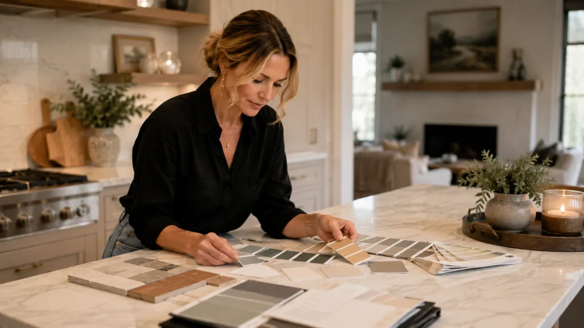
How to Choose Paint Colors You Won't Regret | Katie Lynn Homes & Design
We've all done it — fallen for a paint chip in the store, painted a whole room, and then wondered why it turned green, or gray, or somehow sad. The color didn't lie; the lighting and undertones did. Choosing paint you'll actually love is less about the perfect shade and more about a simple method. Here's the one I use with clients, so your next color feels like a warm hug instead of a "what did I do?"
Start with the feeling, not the color
Before you pull a single swatch, decide how you want the room to feel — calm and restful, bright and happy, cozy and grounded. Color is emotional, and the "right" shade is the one that supports the life you live in that room. A bedroom that should feel serene and a kitchen that should feel cheerful want very different colors, even if you love them both.
The undertone trick most people miss
Every neutral has an undertone hiding underneath — a whisper of pink, green, blue, or yellow that only shows up on your wall, in your light. This is why two "greiges" can look nothing alike. The fix: hold your top choices next to something pure white, and next to your flooring and furniture. The undertone will reveal itself, and you'll see which one actually belongs in your room.
Always test big, and live with it
Paint large swatches (or peel-and-stick samples) on a few different walls, and look at them morning, noon, and night. Light changes everything: north-facing rooms lean cool, south-facing rooms warm, and that "perfect" evening color can feel icy at 9am. Give your top pick a day or two before you commit — it's the cheapest insurance in decorating.
A quick guide by mood
You want the room to feel… Lean toward… Great for
Calm & restful Soft greens, warm whites, muted blues Bedrooms, bathrooms Cozy & grounded Warm greiges, clay, deep earthy tones Living rooms, dens Bright & happy Creamy whites, soft yellows, gentle greens Kitchens, offices Elegant & dramatic Charcoal, navy, rich moody hues Accent walls, dining rooms
Frequently asked questions
Why does my paint look different than the swatch?
Lighting and undertones. A small chip in the store can't show how a color behaves on a big wall in your home's specific light — always test large samples in the actual room.
What are undertones?
The subtle secondary color inside a paint — like a hint of pink or green in a "neutral." They're the reason two similar colors can feel completely different.
How many colors should a whole-home palette have?
A cohesive home usually flows from a small palette — often a main neutral, a soft complement, and an accent — repeated room to room so it feels connected.
Can you just pick colors for me?
Happily — color selection is one of the most-loved parts of what I do, and it takes the guesswork (and regret) out of the process.
Let's get your colors right the first time
The right palette makes a whole home feel calm and connected. Book a consultation and let's find yours, or explore the services to see what fits.


